ShopDreamUp AI ArtDreamUp
Deviation Actions
19.1K Views
Step 1: Idea (message, composition)
You decided that you want to make a photomanipulation. But what to make? There are so many photomanipulations already out there and mostly with the same theme. So you decide you don't just want to stick a pretty girl onto a beautiful background. No you want to be original and have your manipulation portray a message everyone can relate to.
Think of things that are important to you, that lay close to your heart. They can be emotions (love, hate, sadness, anger) or experiences, hobbies (art, sports etc), things you are struggling with. Or they can be global themes like (beauty, money, economy, eating disorders, war, relationships etc.)
Of course if you choose to portray something as love there are many ways to do so. Do you want it to be a surreal depiction of love, or dark, fantasy, sci-fi, conceptual, humourous... your choice will of course decide the whole 'feel' of the image.
So choose wisely as they say.
Now that you have your theme you need to know how you generally want your manipulation to look. This will help with picking the right stock. I know if I don't do this I endlessly wonder around DA looking through stock pictures.
You can do that too and get inspired by a photo you see. That's a different way of approaching it.
So your composition should be interesting a real eyecatcher.
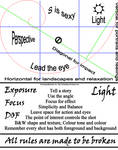
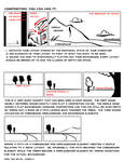
How to make an interesting composition -
Great articles by

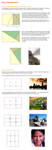
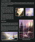
Know your Basics - Composition (the manip way)The Rule of Thirds is another one of those expressions that you have probably heard before somewhere but aren't quite sure what it means. This article strives to shed some light on this rule as well as on how to use lines and shapes in your compositions to lead the viewer's eye to the important bits. There are some compositional rules and pointers that no artist should go without knowing!and
The Technical Part
Rule of Thirds
Thankfully this time, there are no hours upon hours of dry reading to be done because the Rule of Thirds itself can be explained rather easily:
"The Rule of Thirds states that an image should be imagined as divided into nine equal parts by two equally-spaced horizontal lines and two equally-spaced vertical lines, and that important compositional elements should be placed along these lines or their intersections." (from the wikipedia article)
Or - summed up in one image:
<a href="http://fav.me/d37v261">
Know your Basics - PerspectivePerspective comes in different forms, the most obvious & basic of which is the use of the word in relation to the appearance of relative orientation in a three dimensional space. At first, it may seem irrelevant to photomanipulators, (because, hey, the photographs already are perspectively sound,) but putting more than one photograph in context requires that you learn to see what makes sense and what doesn't.
The Technical Stuff
Perspective (from Latin perspicere, to see through) in the graphic arts, such as drawing, is an approximate representation, on a flat surface (such as paper), of an image as it is seen by the eye. The two most characteristic features of perspective are that objects are drawn:
Smaller as their distance from the observer increasesForeshortened: the size of an object's dimensions along the line of
sight are relatively shorter than dimensions acro
More:
Composition explained ~ Conceptart tutorial about composition ~ Phil Straub composition tutorial ~ composition tips ~ landscape composition rules
 Creating a grid of the rule of thirds ~Golden Ratio grid extension PS ~ Golden Crop extension for PS
Keywords here: light, shadows, perspective, placement, colors, contrast, framing, focal point, rule of thirds


Step 2: Choosing stock (and prepping stock images)
So now that you have an idea for your photomanipulation what are you going to do next? Search for the right stock. This is a very important step.
So let's just say you are going for the theme love and the story you came up with is a parting between two lovers at a train station (cliché I know, but it's just an example, bear with me)
First of all when searching for stock try to get the most high quality stock you can get. Try to avoid, blurry, noisy etc. images. Of course when you find a stock which is perfect but it is grainy or the light isn't right you can use the following tutorial to fix that:
Fixing low quality photo's www.darrenhoyt.com/2007/10/10/…
So about the sites you can get your stock from:
1. DA browse.deviantart.com/resource…
2. MorgueFile morguefile.com
3. Dreamstine (paid and some free) www.dreamstime.com/
See
Great Free Stock Image WebsitesSo, I figured I'd post something useful as opposed to being my usual outrageous self.for more handy sites (plus all the information about commercial use) and commercial stock use on DA useI've been collecting links to the most useful free stock sites on the Web, and I wanted to share them with my fellow photo-manipulators.
I tried to order these from strictest rules of usage to least strict. Generally speaking, modifications of the images on these websites are allowed and can be used for most purposes SO LONG AS the original image is not "reasonably identifiable." Still, you should always check the terms of use of each individual website before downloading their images.
Attribution (and sometimes permission) Required:
Sxc.hu http://www.sxc.hu/ --> Please see :iconsanguinevamp:'s update on this website http://fav.me/d5wzrlo
Stock Vault http://stockvault.net/
Pixel Perfect Digital http://pixelperfectdigital.com/
Free Images http://www.freeimages.co.uk/index.htm
NO Commercial Use Allowed:
Photl.com http://www.photl.com/
Limited Commercial Use Allowed:
Commercial Stock UseGreat stock providers
Before you go any further, be aware that these are the current rules of these stock providers and they have the right to always change them in the future. So be sure to always check the rules before you start using the stock for a commercial project.
I will be updating this journal from time to time.DA print allowed
Commercial use unrestricted
Commercial use with restrictions
Main stock focus legend:Model
Objects
Background
Animals
[Bullet; Orange]Commercial use with restrictions
:iconfaestock:[Hesitation][DA Prints] :iconMariaAmanda:[Hesitation][DA Prints] :iconemeraldvenom-stock:[Hesitation][DA Prints]
No use of model stock or ask for special permission on model stock
:icontracys-stock:[House][DA Prints] :iconDamselStock:[Rose][House]:dap
Always read terms and conditions on how you may use the stock and properly credit the owners of the photo's.
These are only a few but I know these get used most often.
What I usually do is type in a keyword (on DA stock images) like train, or station. You get all the stock that have to do with that word. You can select a sub categorie to search more accurately.
Sometimes the choice of words can make a big difference. For example if I type in wave (because I want someone waving) I get a bunch of sea waves. So I decided to select model.
Than I only get models with the word wave. But the word wave still gives me a lot of water pictures.
So I use the word waving instead. Play around with different words and subcategories to get the right images.
I usually save all the stock I want to use for one manipulation in the same folder. For example I name the folder "love - train" and place all the pictures I want to use in there so it is easy for me to find.
Another great tip from XilaPhoenixArt is to bookmark all the dA stock links into a folder that's called "PS materials" so you can easily find back the links and post them in your credits.
Step 3: Cutting out your stock
I usually start with a large canvas size in Photoshop (usually the size of the original photo or A4 for printing purposes).You can decide your type of canvas here (long, wide, square etc).
Canvas sizes - inches and dpi and pixelsThis is a sort of guide on canvas sizes, inches, dpi and pixel x pixels.. psd.tutsplus.com/tutorials/too…
when it came to canvas sizes, I always kind of assumed that inches belonged with dpi and pixels were just pixels and that everyone knew that; but i read a whole bunch of comments on a tumblr blog where someone asked about canvas sizes, and SO MANY people were replying with things such as, "4000x4000 px at 300 dpi" or "2000x2000 px at 200dpi".
and I guess not everyone quite understands what dpi's really used for xD.
DPI = Dots per Inch. It means how many dots will be printed per inch.
DPI is actually used for printing purposes. It shows the printer how much pixels to print per inch, literally. A common printer (at home or even at a lot of printing stores) at best prints at 150dpi most of the time actually; there are some super duper great printers that can print REALLY fine that can go up to ...apparently a lot more xD; #dpi, so that's why everyone usually suggests saving your project at 300dpi; most printers are f
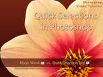
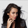
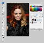
Now how to cut out your stock. I always use Quick Selection (W) in photoshop because it saves time and because you work with masks you can always bring parts back if you make a mistake.
Here are some really good tutorials to get you started:
The basic tool and how to use them: www.surrealpsd.com/core-skills… www.surrealpsd.com/core-skills… www.surrealpsd.com/background-…
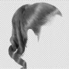
For those troublesome hairs...
 ~
~  ~
~  ~
~ 
How to cut out those pesky trees:
How to make complex selections
Step 4: Blending stock
Matching up colors and hues in different stock is important. You need to do it so that all stock images look like they are part of one picture. You can do this with color balance and hues and saturation option that you can find in the "create adjustment layer" in the layer menu see www.binary-artist.com/photosho…
I would highly recommend working with "clipping masks" psd.tutsplus.com/tutorials/too… "groups" www.photoshopessentials.com/im…
Clipping masks make sure that only the direct layer underneath is effected by the change in for example color or brightness. And groups can be used to place layers and clipping masks into them so you can move them around your canvas all at once.
Another good way to match colors of each stock with each other is with match colors
One of the best tutorials out there:
Great tutorials: :thumb179801967: :thumb179802103:
How to fix overexposed images: www.photoshopsupport.com/tutor…
How to fix underexposed images: www.photoshopsupport.com/tutor…
But not only colors should match up but also the light. Make sure your background and your model have the light coming from the same direction.
Use "lens blur" www.signaturestop.com/tutorial… in the foreground and background to put focus on your subject. For instance blur out twigs in the foreground and the background so only the model stands out. Make sure to copy the background before you do so and use a layer mask on the lens blur layer so you can make the floor around the models feet as sharp as she is.
See what I mean here: and
www.psdbox.com/tutorials/manip… www.psdbox.com/tutorials/thing… www.psdbox.com/tutorials/simpl… www.psdbox.com/tutorials/dodge…
:thumb198706051:
Painted Look
Step 5: Details
Smoothing skins and fixing other body parts: sixrevisions.com/photoshop/26-… www.photoshoproadmap.com/Tag/s…
Sharpening: psd.tutsplus.com/tutorials/too… www.photoshopsupport.com/tutor…
Hair:
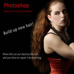
 painting hair ~ painting hair II
Special effects: effects.worth1000.com/tutorial…
Fire- www.photoshoproadmap.com/Tag/f…;
Rain - www.photoshoproadmap.com/Tag/r…
Water - water tutorials 1 ~ water tutorials 2
Step 6: Mood and Finishing touches
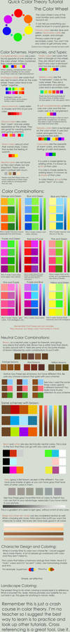
Colors decide the mood of your work. Blue usually gives your work a sad feel while yellow gives a pleasant and uplifting one. I usually use Color balance from "create adjustment layer" menu ontop of all my other layers to set the mood. You can also do this with curves by adjusting the color level there or "gradient map" from the same menu and putting the layer to "hard light", "overlay", "color dodge" or "soft light" and bringing down the opacity. See what I mean here: fav.me/d2qmeuk and Color matching
See this great article about colors by
Know your Basics - Colour Theory (the manip way)Most of us have heard about Colour Theory - be it in school or on dA or as a term thrown about by someone somewhere. But what exactly is it? And how do you use it? This is what this article is striving to explain especially in regards to photomanipulation.
The Technical Part
Thankfully, there's tons of reading material about colour theory. Starting with the wikipedia article on the subject (which seems rather dry and boring to be honest) and ranging to tutorials written by deviants for their fellow artists. Those are the ones I'd like to recommend to you to get started in colour theory: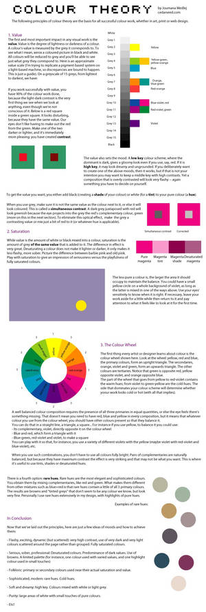
Still too dry and technical?
Okay, let me put it this way: the use of colours in your artwork can determine its mood and atmosphere. If you do it well, it can draw in the viewer and make them see what you want them to see by putting emphasis on certain parts. Colour theory gives you a way to know in
There you go, your done.
Remember have fun and do lots of experimenting in PS!
Check out more great tutorials at:


Thanks for reading.

Be sure to
If you have any tutorials or ideas how to improve this article please leave a comment.
My other walkthroughs:
Artist walkthrough
Coloring tutorial
Feature 32
Time for another art feature! :D I've seen so much spectacular art again this month. :heart: My newest work
Feature 31
Check out these amazing artists!
Enjoy!
Feature
My Newest Art
Feature 30
A new feature for the week. Check out these awesome artworks.
Enjoy!
Feature
My Newest Art
Feature 29
A new feature for this week. More awesome artwork to love.
Enjoy!
Feature
My Newest Art
Featured in Groups


© 2012 - 2024 tamaraR
Comments79
Join the community to add your comment. Already a deviant? Log In
Fixing low quality photo's link doesn't work.